

SwiftUI is a huge step up from UIKit + Interface Builder for app development productivity on iOS. At dateit, our iOS app is written entirely in SwiftUI and we have learned a lot along the way. One of the biggest advantages of SwiftUI is the tight feedback loop you get with view previews. Unlike Interface Builder, you can do much more than just lay out your views and tie code to them later, your views are the code!
Lets build an app together
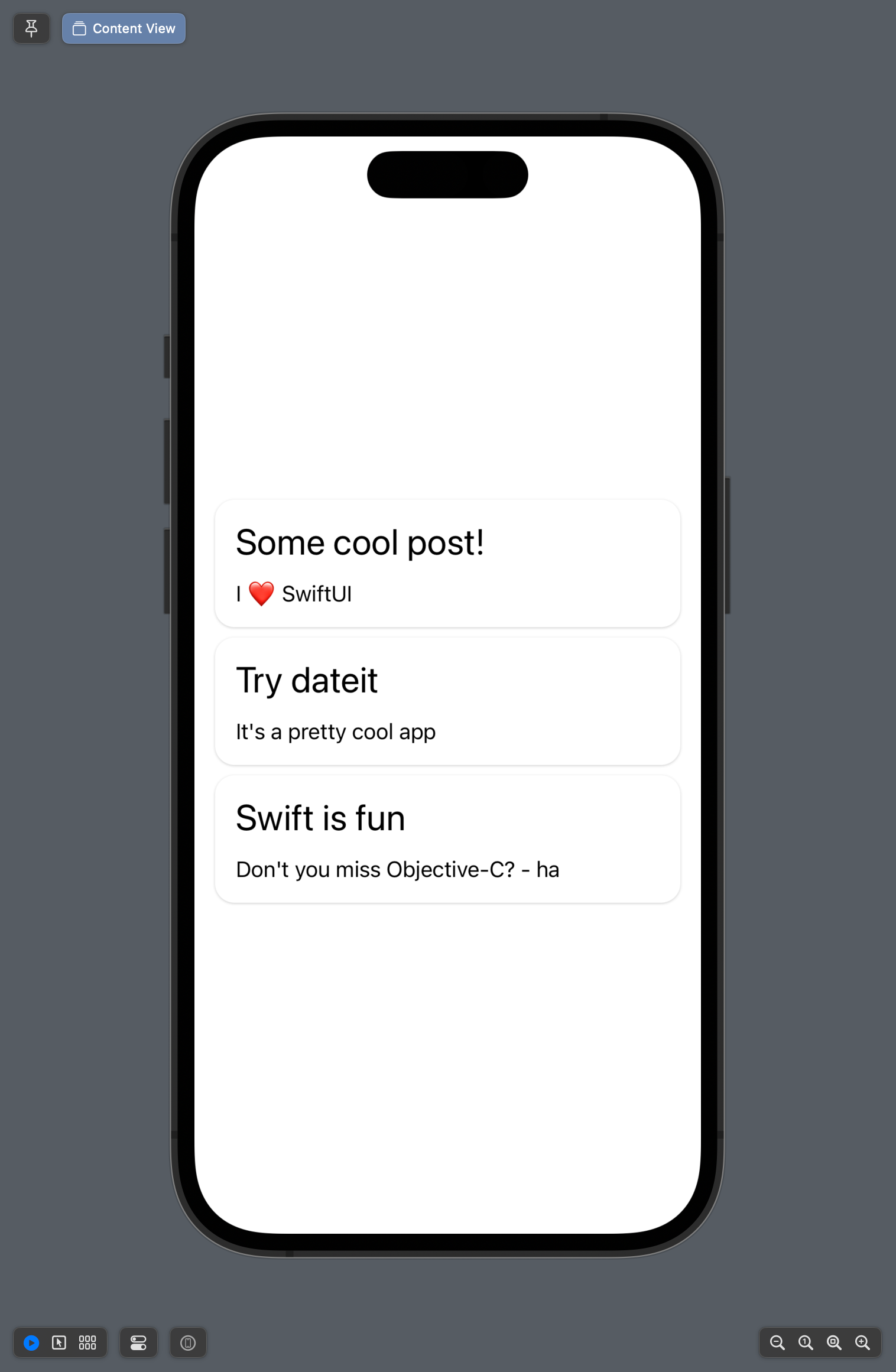
We can start with a simple view that shows a list of cards with some content
import SwiftUI

struct CardData: Identifiable {
    let id = UUID()
    let title: String
    let body: String
}

struct ContentView: View {

    @State var model: [CardData]
    var cardSpacing: CGFloat = 10

    var body: some View {
        VStack(spacing: cardSpacing) {
            ForEach(model) { model in
                VStack(alignment: .leading) {
                    Text(model.title)
                        .font(.title)
                        .frame(maxWidth: .infinity, alignment: .leading)
                        .padding(.bottom, 5)
                    Text(model.body)
                }
                .frame(maxWidth: .infinity)
                .padding()
                .background(.white)
                .cornerRadius(15)
                .shadow(color: Color.black.opacity(0.2), radius: 1, x: 0, y: 0.55)
            }
        }
        .padding()
    }
}

struct ContentView_Previews: PreviewProvider {
    static var previews: some View {
        ContentView(model: [
            CardData(title: "Some cool post!", body: "I ❤️ SwiftUI"),
            CardData(title: "Try dateit", body: "It's a pretty cool app"),
            CardData(title: "Swift is fun", body: "Don't you miss Objective-C? - ha, you probably don't. "),
        ])
    }
}
This is a simple app (if you could even call it that) but it doesn't look very good! Most of the time you would tweak some values, reload the preview and see how it looks. You have probably spent countless hours (cumulatively) reloading views and tweaking numbers. But SwiftUI is much more powerful! Lets see a new way to do it - first by adjusting the card spacing. Lets update our preview:
private struct Preview: View {
    @State var cardSpacing = 10.0

    var body: some View {
        VStack {
            ContentView(model: [
                CardData(title: "Some cool post!", body: "I ❤️ SwiftUI"),
                CardData(title: "Try dateit", body: "It's a pretty cool app"),
                CardData(title: "Swift is fun", body: "Don't you miss Objective-C? - ha, you probably don't. "),
            ], cardSpacing: cardSpacing)

            HStack {
                Text("Card Spacing")
                Slider(value: $cardSpacing, in: 0...100, step: 1)
                Text("\(Int(cardSpacing))")
            }
        }
        .padding()
    }
}

struct ContentView_Previews: PreviewProvider {
    static var previews: some View {
        Preview()
    }
}
Instead of having a simple static preview holding our view, we now have a wrapper view that adds some controls. These controls let us override the card spacing and use a slider to control it. Since the SwiftUI preview is interactive, you can use SwiftUI elements to adjust other SwiftUI elements! The best part is - by wrapping your view, you never have to expose the preview controls in your app.
Now with our new interactive controls we can find that perfect spacing in real time! Lets take it further and add some more controls.
private struct Preview: View {
    @State var cardSpacing = 10.0
    @State var cardRadius = 15.0
    @State var contentPadding = 15.0
    @State var shadowDepth = 1.0

    var body: some View {
        VStack {
            ContentView(
                model: [
                    CardData(title: "Some cool post!", body: "I ❤️ SwiftUI"),
                    CardData(title: "Try dateit", body: "It's a pretty cool app"),
                    CardData(title: "Swift is fun", body: "Don't you miss Objective-C? - ha, you probab ly don't. "),
                ],
                cardSpacing: cardSpacing,
                cardRadius: cardRadius,
                contentPadding: contentPadding,
                shadowDepth: shadowDepth
            )

            HStack {
                Text("Card Spacing")
                Slider(value: $cardSpacing, in: 0...100, step: 1)
                Text("\(Int(cardSpacing))")
            }
            HStack {
                Text("Card radius")
                Slider(value: $cardRadius, in: 0...100, step: 0.1)
                Text("\(cardRadius, specifier: "%.1f")")
            }
            HStack {
                Text("Content Padding")
                Slider(value: $contentPadding, in: 0...100, step: 1)
                Text("\(Int(contentPadding))")
            }
            HStack {
                Text("Shadow Depth")
                Slider(value: $shadowDepth, in: 0...100, step: 0.1)
                Text("\(shadowDepth, specifier: "%.1f")")
            }
        }
        .padding()
    }
}
This change adds controls for:
- Card spacing
- Card radius
- Content padding
- Shadow depth
Conclusion
You should be using SwiftUI previews as part of your workflow. You can refine your design much more quickly, like dialing in that perfect drop shadow, or the best looking corner radius. The complete code for this project is below.
If you liked this post, give dateit a try to plan your next event and see all of the impressive work we have done with SwiftUI.
import SwiftUI

struct CardData: Identifiable {
    let id = UUID()
    let title: String
    let body: String
}

struct ContentView: View {

    @State var model: [CardData]
    var cardSpacing: CGFloat = 10
    var cardRadius: CGFloat = 10
    var contentPadding: CGFloat = 15
    var shadowDepth: CGFloat = 1

    var body: some View {
        VStack(spacing: cardSpacing) {
            ForEach(model) { model in
                VStack(alignment: .leading) {
                    Text(model.title)
                        .font(.title)
                        .frame(maxWidth: .infinity, alignment: .leading)
                        .padding(.bottom, 5)
                    Text(model.body)
                }
                .frame(maxWidth: .infinity)
                .padding(contentPadding)
                .background(.white)
                .cornerRadius(cardRadius)
                .shadow(color: Color.black.opacity(0.2), radius: shadowDepth, x: 0, y: shadowDepth * 0.55)
            }
        }
        .padding()
    }
}

private struct Preview: View {
    @State var cardSpacing = 10.0
    @State var cardRadius = 15.0
    @State var contentPadding = 15.0
    @State var shadowDepth = 1.0

    var body: some View {
        VStack {
            ContentView(
                model: [
                    CardData(title: "Some cool post!", body: "I ❤️ SwiftUI"),
                    CardData(title: "Try dateit", body: "It's a pretty cool app"),
                    CardData(title: "Swift is fun", body: "Don't you miss Objective-C? - ha, you probab ly don't. "),
                ],
                cardSpacing: cardSpacing,
                cardRadius: cardRadius,
                contentPadding: contentPadding,
                shadowDepth: shadowDepth
            )

            HStack {
                Text("Card Spacing")
                Slider(value: $cardSpacing, in: 0...100, step: 1)
                Text("\(Int(cardSpacing))")
            }
            HStack {
                Text("Card radius")
                Slider(value: $cardRadius, in: 0...100, step: 0.1)
                Text("\(cardRadius, specifier: "%.1f")")
            }
            HStack {
                Text("Content Padding")
                Slider(value: $contentPadding, in: 0...100, step: 1)
                Text("\(Int(contentPadding))")
            }
            HStack {
                Text("Shadow Depth")
                Slider(value: $shadowDepth, in: 0...100, step: 0.1)
                Text("\(shadowDepth, specifier: "%.1f")")
            }
        }
        .padding()
    }
}

struct ContentView_Previews: PreviewProvider {
    static var previews: some View {
        Preview()
    }
}